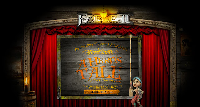
I remembered this promotional website for the game 'Fable II' from a couple of years ago that I was impressed with at the time. The website told an animated interactive story in which the user plays the role of an adventurer growing up. The outcome of the story differs depending on the choices that you make as the character (e.g. Good/Evil, Greedy/Philanthropic) with quite a few different routes to choose from at different points in the story. It is a bit outdated now as Fable III was just recently released but I managed to find the old website.
One of the things that struck me about the animation was the style in which it was animated. It uses a lot of layers and very little frame by frame animation that I can see, meaning most of it is just tweening of the existing layers (so for example, each arm part, leg part, torso and neck are on different layers that just move around each other). It also has a really strange mixture of a kind of collage look which makes it really cartoony. Stranger still is the way that the background design doesn't share the same style as the character design and neither resemble the actual game at all, yet it still works overall and is quite interesting to watch. It also has some pretty harsh points of violence in quite a black comedy kind of way which contradicts the connotations of the cartoon style but represents the game quite well.
This same style of animation could be quite simply reproduced in after effects for the most part because it would just use layers and simple transformations over time which we have already learned about. This wouldn't have been made in after effects because of the amount of interactivity and its precision. This website would have been made using Adobe Flash as it can animate the more 'frame-by-frame' parts of the movie like the blood spurts but mainly because it would have been coded using ActionScript. ActionScript is a Flash-based 3rd level programming language used within the animations/movies/games which is there pretty much specifically to create really vast interactivity in the application.
This is the link to the site so you can see for yourself: http://fable2.xbox.com/Experience.aspx
Here is an example of a small part of the animation on the website so that you can see the kind of style that i'm talking about.


No comments:
Post a Comment