Showing posts with label Packaging. Show all posts

Thursday, 11 November 2010

Interesting in-flight meal packaging

I found these examples of some of the more interesting inflight meal packaging around. These examples keep everything together and look better than usual as well. This is the kind of thing that I want to achieve.

This example below is from Quantus Airlines. they are one of the worlds leading airline companies and they really expensive flights so you would have thought that they could produce some good results. The example below is a good start at creating better inflight packaging. It is much simpler than conventional packaging and keeps everything together which makes it more environmentally friendly and less hassle to deal with. It looks as though it is made from a polystyrene material so it is likely recyclable.
The only issue with the packaging is that it doesn't look very nice. In fact it probably looks less inviting than the conventional separate packaging of in-flight meals.
It is a good start but it could do with some more designing.


These examples below are from Hawaiian Airlines and show a much more considered approach to designing. The packaging is made from 200% recycled materials and the colours and textures work well to communicate jungles and trees and connotations of hawaii. This example just has space for the main meal part (sandwich) and the desert on the right. This helps to keep it simple and the packaging is a nice format to work with. I should consider the possibility of simplifying my designs like this to keep them effective and not too busy.


This example below is another Hawaiian Airlines meal but this time it is more separate. It still works well as a meal setting because everything fits inside the tray almost perfectly and it has obviously been considered, although the packaging above probably works better overall.


Finally these examples below are from Singapore Airlines and show a design that has clearly been thought through. The design is sleek and elegant and looks almost more like a gift than a meal which I think works well to make it inviting and almost forces audience interaction. 
The packaging is neat and keeps everything together and the food inside is laid out to fit well inside the box. I think that the box shape could be more compact, especially considering the amount of space left inside the box but in terms of graphically considered packaging this is probably the highest quality of the meals that I have seen. 


Existing examples of airline meals

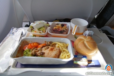
These are some existing examples of airline meals.
it is obvious that is little order to the trays and the whole thing looks like a mess. I want to design a simple net that can be turned into a box that can hold each part of the meal and promote the campaign at the same time.
From the examples below you can see that a meal will generally consist of 1 main meal box, 2 smaller pots and a drink or two (water/juice/coffee).


Tuesday, 9 November 2010

Dan Marino

Dan Marino is a designer who just graduated over summer from the North Carolina State University with a degree in Graphic Design. This work in particular is relevant to a similar kind of thing that i am trying to produce. This example is meal packaging for a Senior Citizen meal at K&W Cafeteria.
There are 4 different meals available, each dealing with a specific medical issue which the meal counters or is suitable for.
The packaging is simple and fits together nicely which is something that i want to aim to achieve. Meals on flights generally have way too much packaging and are spread around on a tray. If I can design the packaging to be more economically viable then it will reinforce the quality of the design and will help associate the brand with positive morality and a good cause.


Thursday, 21 October 2010

Brooklyn Fare


"Brooklyn Fare is a new, full service grocery store located in Downtown Brooklyn. The identity we created is very simple: one custom proprietary typeface (Fare Serif), four colors, and lots of witty copy. The text is useful in highlighting the store's diverse range of quality products and high standard of service, while at the same time presenting the customer with a bit of humor."


Pretty nicely summed up.
I'm not really into type but I can definitely appreciate the design. What I like the most is that they gave themselves a set of restrictions to work with while designing and it clearly paid off. I think that restrictions could stop a project from becoming lost in too many ideas and keep it focussed. This is definitely something to consider in my work as I almost always get sidetracked and confuse myself. 

Lokum - Tamer Koseli

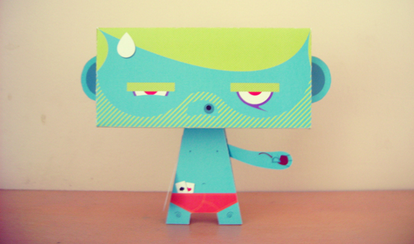
This product has been designed as packaging for turkish delight which can also be simply made into a kind of toy. At least I think that's what is going on. 


This is quite a nice idea for a design. I like the fact that it uses such a simple net to create the toy and that it gives the packaging a secondary use instead of just holding the product. 
The character designs are quite interesting and would definitely relate to children so in all of those respects I think this is a really good product. 

It is really interesting to see the way that Koseli has kind of recycled the packaging without it ever having to be thrown away. Obviously it will eventually be thrown away because everything is but it is a nice way to look at packaging that I might try to consider in my brief. 

Print-wise I'd guess that these are just simple digital print CMYK because of the varied colours on each design although I think some of them could have been printed with 6 spot colours if mass produced. 

Alternativa 3 - Fair Trade Products

Alernativa 3 are a Spanish based fair trade company who deal with producing high quality export products and make sure that all the workers get a fair share of the profits so that everyone gets what they have worked for. They produce coffee, chocolate and a few other products for sale. 


This company deal properly with human rights which I admire in any company and I am definitely interested in pursuing ethical-based design as a future. I also really like the simple designs and use of colour. 
Each design only has about 2 or 3 different colours on it which gives it a clear and bold packaging.
This is most likely a spot colour print job because of the few colours used. 

I also really like how each different type of the same product keeps the design and just changes the colour. This gives the products a sense of branding and unifies each individual design in to a group.
In the bottom example you can see that the same kind of design has been used across a few different products which shows that they are linked together.
I will need to create some kind of product branding for my print brief.

La Perle

These label and packaging designs for beer have a similar authentic and traditional feel to them as the Bacchus Frambozenbier from the print deconstruction exercise but they have managed it solely through design and have stuck with the contemporary labels on the bottle. 

 The clever use of 40's/50's imagery gives it a really old feeling as does the wrinkled look on the labels. I can't tell if the labels are actually wrinkled or not, but it is most likely just printed that way. the colours are also quite faded looking as though the print production was done a long time ago.
Again, the use of the brown bottle makes the product seem a lot more traditional than the green or clear bottles that are used in most contemporary beers.
The designer has also cleverly linked the images with the descriptions of the beers.
It has been designed so that the type of beer relates to the women on the bottle, i.e. Blonde, Brunette etc. which are already descriptions of beers and the designer has made a clever link.
Semiotically this descriptive system is really relevant. The comparison to the women is quite sexist and a bit demeaning as are the pictures of the women smiling and effectively becoming part of the product promotion. In a way the women are being directly compared to the beer as a product.
This was relatively normal behaviour in the 40's/50's so it links in with the rest of the packaging well.

Melvin Galapon - Show Off


This is a 12" record design by Melvin Galapon. It is called Show Off and was designed for the sheffield based electro production duo Run Hide Survive. 
I really like how the design is so simple but was actually quite complex.
It is a 12 layer screen print of an edition of 100. 
I really like the use of the invisible type that can only be seen at the right angle.
Im not exactly sure how this has been produced but I think that a similar result could be created in industry using spot varnish.
The colours and the design remind me of the blocks of colour that came up when terrestrial TV would turn off really late at night before most TV became 24 hour.

Sunday, 17 October 2010

Chosen nets


I have chosen to use the nets below for the brief. I have picked these nets because out of the 5 I think that they relate most to my brief. Because I am developing a kind of campaign, the mail shot-like designs are really  suitable and the box net could be used in a similar way. 


Wednesday, 13 October 2010

Packaging Nets

To start the brief we had to pick 1 word that summarises our researh for the Good brief and 1 image.
We then had to pick 5 nets from a series of 15.
Out of those 5 nets we then have to pick 3 and try to design packaging using the word and the image and communicate our project so far. This brief is effectively about experimenting with packaging and looking in to different ways of creating the content.

These are the 5 nets that I picked and the things that they make when assembled


To me the above constructed net looks like some kind of mail shot or leaflet that opens in stages to reveal different parts at different times. 


This is a similar design to the one above it but even simpler in design. The unfolded shape is definitely less uniform.


Again this could be some kind of leaflet or mailshot which unfolds to a square shape which is quite a generic format but is a good one to work with. I like the folded up hexagon shape. 


This looks like a bit like a bag for wine or some kind of bottle. It is a bit like a normal shopping bag which has been extended at the bottom. This could be quite challenging to work with. 


This one is a relatively simple box shape but could be interesting to design on the outside and inside of the box.