"Strong Stuff" is the design company of illustrator and designer Tom Whalen. He has a minimalist illustration style with a really cartoony feel which fits perfectly to all of his work, especially the Disney posters below.
Showing posts with label OUGD301. Show all posts
Tuesday, 8 November 2011
Matthew Woodson
Woodson is almost exclusively an illustrator from southern Indiana. He has a really kinda of realistic style to illustration and most of his work is really impressively detailed. It holds a comic book style but in much more detail, and then some of his work is kind of reminiscent of editorial design. It is not much a style that I really use or want to include in my briefs, but impressive nonetheless.
Labels:
OUGD301
James Jean
James Jean is an illustrator and designer born in Taiwan who lives and works in California. His style ranges a lot, but always focusses around some kind of illustration, almost always a human figure or animal (rarely completely abstract).
Labels:
OUGD301
Invisible Creature
Invisible Creature are a design company who focus mostly on illustration and illustrative design. They have clients like Nike, Nickelodeon and MTV but also a lot of smaller clients. Their work has a range of styles depending on the client and the requirements.
Labels:
OUGD301
Chris Ware
Chris Ware is an illustrator and animator and part of the collective "Drawn and Quarterly". His work has a really cool simplistic, cartoony style. It is really easy to look at and the animations are smooth and fairly realistic for the style.
Labels:
OUGD301
Wednesday, 12 October 2011
Russ Mills - Byroglyphics
I found these really nice detailed illustrations based around human form mixing with different animals which are by Russ Mills. Mills is a designer/ illustrator from Devon who studied at Leeds Metropolitan University on a BA Graphic Art and Design degree.


Mills creates a really nice style of illustration by mixing conventional drawing techniques with a bolder artistic approach similar to expressionism or some other kind of abstract art form. It's a really cool chaotic kind of effect which looks kindof demonic and has a slightly dark feel to it which fits nicely to the Sandman narrative.
Mills has a design agency/company called Byroglyphic who work with a variety of different styles but usually focus on the illustrative approach to design.
Labels:
OUGD301
Atelier Olschinsky
Atelier Olschinsky is a graphic design agency consisting of two designers; Peter Olschinsky and Verena Weiss. They are based in Vienna, Austria and work with illustration, photography and graphic design as a whole.
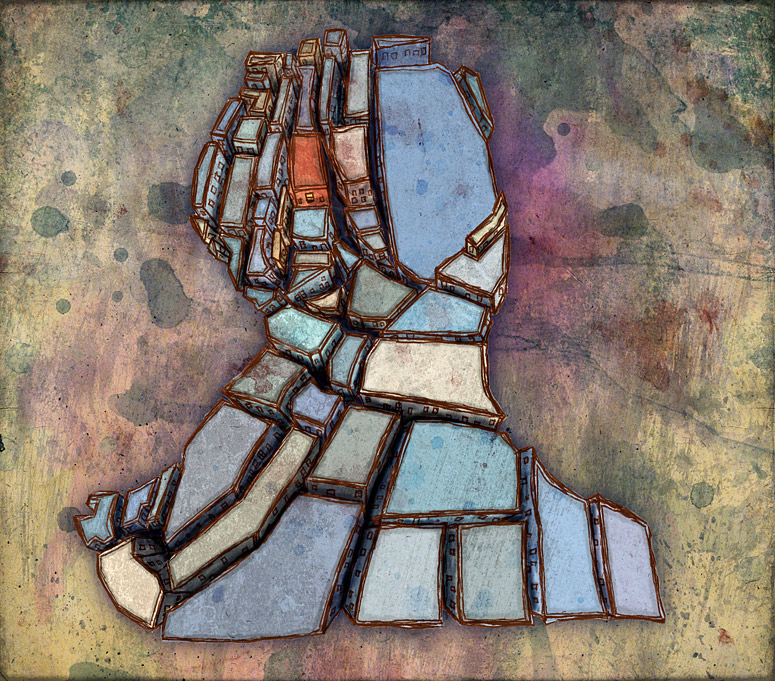
I found these illustrations from a set called 'Cities III' (Unsurprisingly the third set of these similar illustrations).
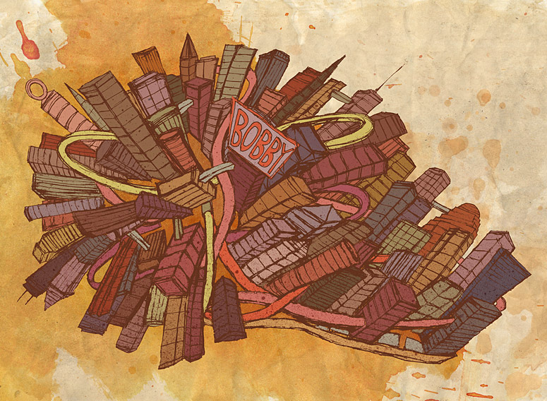
The illustrations and the motion sequence posted above were created by the designer and illustrator Brian Drucker. There isn't a whole lot of information about Brian Drucker, but he seems to prefer using motion graphics over other kinds of design and seems to have a pretty good client list and range of work.
Olschinsky also work with more conventional graphic design such as publications like this one:
I found these illustrations from a set called 'Cities III' (Unsurprisingly the third set of these similar illustrations).
Although the cubic kind of composition isn't that relevant to the comic brief, I really like the immense detail of each image and the colour composition. Although they are pretty abstract, they do have a connected kind of illustrative/ cartoony style to them which makes them look a bit comic-like.
They immediately reminded me of the mind map drawings from the film "It's Kind of a Funny Story":
The illustrations and the motion sequence posted above were created by the designer and illustrator Brian Drucker. There isn't a whole lot of information about Brian Drucker, but he seems to prefer using motion graphics over other kinds of design and seems to have a pretty good client list and range of work.
Olschinsky also work with more conventional graphic design such as publications like this one:
This book shows how the agency seems to work preferably with and around photography with a really clean, contemporary graphic design look. It is interesting that both these pieces of design came from the same studio, showing that they have a good range of skills in design.
Labels:
OUGD301
Subscribe to:
Posts (Atom)