Tuesday, 9 November 2010

Andreas Preis

Andreas Preis is a freelance illustrator from Nuremberg in Germany. Again this work stood out originally because of the use of only black and white and because of the detail of illustration.
These illustrations show that the designs can be stylised (In this example with the use of lines which look a bit like fibres in muscles) and still retain realistic quality. It makes the images more interesting to look at and increases the detail and level of care and consideration that must have gone into the image making it more impressive as a whole.


Daniel Lee

Daniel Lee is a UK based architecture graduate who practices illustration in his spare time.
These illustrations stood out to me because of the relevance to my ideas in terms of monotone colour and style.
Style-wise the images use a similar style of cross hatching to create shadow and tone instead of another colour which is what I have ben experimenting with so far in logo design and in illustration.
The cartoony effect is not something that I have thought about in my designs as I think it would take away from the serious underlying theme of the brief.


Monday, 8 November 2010

Manta Ray Skeleton

After looking into what a Manta Ray skeleton actually looks like I found that it doesn't really look much a skeleton in the conventional sense meaning that it wouldn't really communicate properly across the illustrations.


This means that if I take this idea forwards I would have to try to link it across to a human skeleton instead of a manta skeleton. I think it could still be possible because the underside gills do represent human ribs pretty well.

Marcelo Oliveira

Oliveira is another illustrator with a specific style. A lot of the things he creates are in black and white which I am considering for the brief so his work is quite relevant.
These illustrations show a really really high level of detail which is one of the reasons that they are so impressive.
I can't tell exactly how the images have been created but they definitely started at some point as hand drawn illustrations and then may have been vectorised using Illustrator.


I want my images to be eye catching and the great detail shown in these illustrations shows how it can be really effective even in black and white illustration. 

L. Filipe dos Santos

L. Filipe dos Santos is a Portuguese illustrator born in 1978. His work is almost exclusively a study of human form, more specifically of facial expression. The way that the characters are drawn usually gives them a sense of animation as though they are a frame in mid movement which is a really impressive skill.
I think that this is a achieved through a slight exaggeration of scale in some parts. This is often used in animation because you can take great liberties with scale and proportion if images are in quick succession.
Used in the context of these illustrations it gives the characters more life.
Despite the stylised slight cartoon effect in most of the images they still retain personality and humanity and the focus is on the content of each image and not on the fact that they are clearly drawn and are not real.


The style shown in the two portraits above is interesting because it represents a messier approach to illustration but with incredible detail. This is a much more artistic style of illustration than conventional illustrative graphic design would conform to but it still creates a really nice effect. I like the fact that the illustrations don't have to go right to the edge of the paper or even round off properly; they can just end and you still understand the form that is being communicated.  

Wednesday, 3 November 2010

Design Ideas

These are a few examples of the kind of things that could be used for design ideas. These either show existing examples of ideas that I came up with on design practice or they show the kind of things I mean.


Posters like this are well positioned because they are at a point where people are standing still and generally have nothing to do except look around and wait. 


The side of a train could be a really eye catching place to design for. People don't expect to see much on the side of a train besides the usual design like in the image above. A really nice eyecatching design could work effectively. 


These posters on the inside of trains and buses are quite generic and don;t particularly stand out but they probably do get looked at quite a lot. The issue with designing for these would be that my poster could blend in really easily. 


Designing for a billboard is similar to designing for any kind of poster except that the placement is slightly better. Generally billboards are not surrounded by any other design which makes them stand out so a well produced billboard design could work well. 


This design above shows how bus exteriors can be completely designed for promotion. I could take advantage of this as buses move around a lot and get seen by a lot of people. This could be a good way to get my design seen. 


Luggage collection points at airports have rotary conveyor belts like the one above. You can see that the design above works really successfully because it is very relevant to the product being advertised. Unfortunately I can't see any way that manta rays are related to a conveyor belt in the way they look or in characteristics but it could still make a nice design. 


Similar to the design above this shows how escalators can be designed for. Again it isn't that relevant but it is quite different and could make for a nice design. 


Again again this image shows a rotational conveyor belt can be used. This is a substitute for the ones that are on the ground in airports which make the journey down long corridors quicker. This one is actually a belt for a supermarket checkout but you get the idea. 


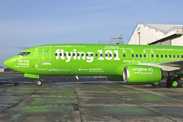
Above shows how the outside of a plane hull can even be designed for. It would be really unusual to see a nicely designed plane that wasn't just advertising the airline brand so it could work nicely. 


These refreshment trolleys are already designed for but could be changed to incorporate my designs. They pass people at about head height when sitting so they would be really noticeable and should grab some attention. 

This image above shows how something simple can be designed cleverly. I could use small items like napkins to promote the campaign. 


In flight magazines often have articles about the destination of the flight such as the tourist attractions and what there is to do around the area. They also focus on local news and feature articles about products and other things so I could take advantage of the in flight magazine and create an article (Maybe just a double page spread) which focusses on manta rays and explains why they should not be eaten and what tourists can do about it. For any other products on the flight I could link the designs to the article (E.g. "For more information see page 30 of the in flight magazine").


Coffee cups aren't very ground breaking for designing on but they are a simple format and people hold them a lot. And a lot of people drink coffee. 


This is probably one of the better ideas that I came up with. Anyone who has ever been on a flight with a meal will know that there is a ridiculous amount of packaging on each part of the meal. I can take advantage of this by redesigning packaging to fit my focus. 
I can work to redesign the packaging to make less of it, make it look neater and generally unify everything in front of the passenger while at the same time designing for the campaign.
The project is all about not eating manta ray so what better place to promote it than on meal packaging?


This idea is a bit simple and is quite irrelevant compared to others. All accommodation will have some kind of key so I figured that it could be designed for. People always make sure they have their keys on them so it could be a good place to design on. The ones above are a bit embarrassing, but the Starbucks key in the top left actually works quite well.


This idea is based around the harbour villages where manta rays might be caught and served in local restaurants, especially if there is a big tourist industry in the town. Liners are absolutely huge which means that they can be seen from a long way away.
Designing for the side of a liner means that people would be able to see it from a really long way away which is always good. 

Controversy

This is probably one the most controversial pieces of design that I have seen. 
But I suppose that is the point. It is surprising and shocking and thought provoking.
That makes it work. 

Manta Rays and Skeletons


I only really just noticed the similarity between the gills on the underside of a Manta ray and human ribs. 
This visual link to a skeleton could work nicely to communicate the idea that manta rays are dying out because skeletons usually = death. 
I will experiment with trying to use this idea and illustrate some skeletal looking designs. 

Monday, 1 November 2010

WWF - Oceans Rising


This is a really clever use of a billboard by the World Wildlife Fund. The designers have taken advantage of a clearly sunny area by forcing the light to make the design work.
The billboard has a shaped awning sticking out over the top so that the bright sunshine casts a clear shadow on the billboard. The result is a really effective and recognisable representation of the surface of water.
When the sun moves across the sky it makes the water pattern rise, supporting the statement on the billboard.

Another picture

Here is another impressive image of a manta ray jumping out of the water.


As far as I know there aren't that many animals that jump out of the water, especially not ones that breathe through gills in the water and especially ones that seem to have no purpose in jumping out of the water.

In this sense I guess manta rays are quite unique, which means that this is some imagery that I could take advantage of in my designs.