Wednesday 12 October 2011

Russ Mills - Byroglyphics

I found these really nice detailed illustrations based around human form mixing with different animals which are by Russ Mills. Mills is a designer/ illustrator from Devon who studied at Leeds Metropolitan University on a BA Graphic Art and Design degree.


Mills creates a really nice style of illustration by mixing conventional drawing techniques with a bolder artistic approach similar to expressionism or some other kind of abstract art form. It's a really cool chaotic kind of effect which looks kindof demonic and has a slightly dark feel to it which fits nicely to the Sandman narrative. 

Mills has a design agency/company called Byroglyphic who work with a variety of different styles but usually focus on the illustrative approach to design. 

Atelier Olschinsky

Atelier Olschinsky is a graphic design agency consisting of two designers; Peter Olschinsky and Verena Weiss. They are based in Vienna, Austria and work with illustration, photography and graphic design as a whole.

I found these illustrations from a set called 'Cities III' (Unsurprisingly the third set of these similar illustrations).


Although the cubic kind of composition isn't that relevant to the comic brief, I really like the immense detail of each image and the colour composition. Although they are pretty abstract, they do have a connected kind of illustrative/ cartoony style to them which makes them look a bit comic-like.

They immediately reminded me of the mind map drawings from the film "It's Kind of a Funny Story":


The illustrations and the motion sequence posted above were created by the designer and illustrator Brian Drucker. There isn't a whole lot of information about Brian Drucker, but he seems to prefer using motion graphics over other kinds of design and seems to have a pretty good client list and range of work.

Olschinsky also work with more conventional graphic design such as publications like this one:


This book shows how the agency seems to work preferably with and around photography with a really clean, contemporary graphic design look. It is interesting that both these pieces of design came from the same studio, showing that they have a good range of skills in design. 

Saturday 8 October 2011

"The Sandman"

The comic book series that I'm choosing for the comic brief is the series called 'The Sandman'. It was written by Neil Gaiman and illustrated by a bunch of different artists, illustrators and designers from all parts of the world.


Brief History:

The Sandman series was first written and proposed by Neil Gaiman for the revival of the 1974-76 DC comic "Sandman" (A much tamer and more conventional comic series).


A while later, Gaiman was accepted as the writer of the new Sandman, the catch being that he had to create entirely new characters which had nothing to do with the old Sandman. The first issue of The Sandman was released in October 1988


Story: 

The Sandman narrative is set in the DC universe. This means that some of the regular DC comic characters are found in and around the story of the comic, for example the "Justice League" (Batman, Superman, Wonderwoman etc).


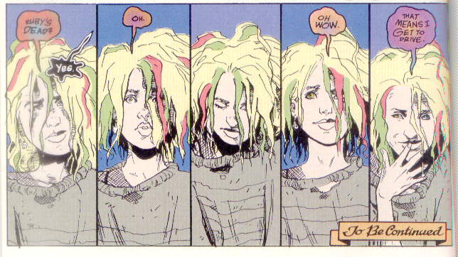
The main character of the stories is a guy called Dream. He is referred to as Dream, Morpheus, The King of Dreams and a few other names, but in short he is simply the anthropomorphic personification of dreaming as a whole. Kind of like a God, but there is no difference between him and actual dreaming. It's all pretty mystical and weird.
As a character, he has 6 brothers and sisters who are all god-like in the same way that he is, each the personification of their own thing or "realm" and each with a name beginning with D. They are Destruction (Who is actually absent for the majority of the comics as he quits the job), Despair, Desire, Delirium (Formerly Delight), Destiny and Death. Each of them has control of their 'thing' and each has to kind of rule over everything to do with it in their own way.


Comics:

In total there were 75 issues of the Sandman, with a few different releases of compiled versions and more recently the 'Absolute Sandman' compilations which fit everything into just 5 volumes.

Thursday 6 October 2011

Sin City: A Dame to Kill For

The 'Sin City' series have some really nice simple comic cover designs utilising just black, white and red. They are focussed on a comic style of illustration which is obviously really relevant, along with the fact that the Sin City comics themselves use the black and white style with some intermittent use of colour which relates directly to the film noir style of story that Miller intended to show. The covers will have been drawn by Frank Miller and the stories themselves were written by him as well.


Respectively, the same appropriateness of covers can be said for the Dave Mckean covers of the sandman. Each of the Sandman comics has a number of different chapters and each chapter tends to be drawn by a different comic artist meaning a variety of styles and interpretations of the stories and characters. So in a sense the cover incorporates a bunch of different mediums together which relates nicely to the range of stuff within the comics themselves. Nonetheless I do still really like this simplified look and want to create a much less over-the-top style than those which Mckean has created.

Tuesday 4 October 2011

Preacher Covers

The Preacher series is another that I really like and has potential for the comic brief. The covers fit a lot more into what would be considered generic comic book covers, largely illustration based and a bit over the top. I don't want to make anything too generic otherwise what would be the point of redesigning at all.

They have all been illustrated by Glenn Fabry, an award winning comic artist well known for work with 200AD and DC, Vertigo and Dark Horse. These are the covers for the collected editions of the whole series:

Absolute Sandman

Since the release of the original sandman series throughout the 90's and early 200's, Gaiman has re-released the set once already into 5 editions called "Absolute Sandman". Buying individually makes up 10 or 11 separate comics, so to have them all in only 5 is much better use of space.
I think I would use these as the basis for my redesign because it would be much better to work with less editions in terms of packaging. These are the current covers for each, again by Dave Mckean:


The yet to be released 5th edition probably has this cover:

Sandman Covers

As research for the comic brief I've looked at the existing examples of comic covers for the Sandman series. I haven't decided on a series yet but the Sandman is my favourite so it could be a good choice to work with though it may also be quite a hard one.


The sandman covers are illustrated by Dave Mckean, and artist from Berkshire who currently lives in Kent. He works pretty exclusively with mixed media collage to create his covers but also works with illustration and some type for titles and names etc. 


You can see that each of the covers does link and each has elements that remain the same throughout which link them together. They also all share a kind of chaotic grittiness and they are pretty clearly sinister. The narrative is generally quite dark which comes through in the covers so in that sense they are suitable.

What is most striking about the covers is that they are obviously very fine art-like in execution which is massively out of character for a comic book series, especially one set in the DC universe (Batman and Robin and the Justice League etc).

I want to create a really different kind of look for the covers, maybe a lot cleaner and a bit more in line with contemporary graphic design. I haven't decided whether to go down an illustrative route or symbolic but image will be the main focus. I hadn't considered the sinister look for the covers which might be important.