Monday 15 November 2010

Atelier Martino&Jaña

The Atelier Martino&Jaña design project was started in 2000 by Joao Martino and Alejandra Jana and has grown in to a team of designers and collaborators. They are a Portugal based design company that who focus around design for print, usually magazine and editorial design.
They have quite a distinctive clean and simple design style which comes across as a with a really professional and considered look. They work a lot with incorporating photography in to their editorial design and clearly have a really good understanding of the use of type.


I'd like my double page spread to have the same kind of professional and well finished feel to it. 

Thursday 11 November 2010

Michael Caputo

Michael Caputo is a graphic artist and illustrator who works across a range of formats and practices.
His work that caught my eye was the graphic illustrations of women screaming in horror movies.
They have a nice style to them which represents the kind of old style horror film and the images are bold despite being in just black and white.
He also uses this angular style with blocky triangles as a kind of hatched shading which gives them a pop arty look. It is a very interesting idea to create shadow detail.


Alexandra Dolgopolova

Alexandra Dolgopolova is an artist and illustrator from Togliatti in Russia. She uses a mixture of painting inks and illustration to create her work. It gives a really nice effect to have the extreme detail of the illustration contrasted by messier ink splashes. She work with some colour but tends to stick to monochromatic illustration which is relevant for the illustrations that I am creating.
Dolgopolova focusses mainly on faces but also works with some full body illustrations. I have not seen any of her work that strays from reproducing the human form but she does have a lot of talent for illustrating it.


Interesting in-flight meal packaging

I found these examples of some of the more interesting inflight meal packaging around. These examples keep everything together and look better than usual as well. This is the kind of thing that I want to achieve.

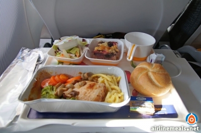
This example below is from Quantus Airlines. they are one of the worlds leading airline companies and they really expensive flights so you would have thought that they could produce some good results. The example below is a good start at creating better inflight packaging. It is much simpler than conventional packaging and keeps everything together which makes it more environmentally friendly and less hassle to deal with. It looks as though it is made from a polystyrene material so it is likely recyclable.
The only issue with the packaging is that it doesn't look very nice. In fact it probably looks less inviting than the conventional separate packaging of in-flight meals.
It is a good start but it could do with some more designing.


These examples below are from Hawaiian Airlines and show a much more considered approach to designing. The packaging is made from 200% recycled materials and the colours and textures work well to communicate jungles and trees and connotations of hawaii. This example just has space for the main meal part (sandwich) and the desert on the right. This helps to keep it simple and the packaging is a nice format to work with. I should consider the possibility of simplifying my designs like this to keep them effective and not too busy.


This example below is another Hawaiian Airlines meal but this time it is more separate. It still works well as a meal setting because everything fits inside the tray almost perfectly and it has obviously been considered, although the packaging above probably works better overall.


Finally these examples below are from Singapore Airlines and show a design that has clearly been thought through. The design is sleek and elegant and looks almost more like a gift than a meal which I think works well to make it inviting and almost forces audience interaction. 
The packaging is neat and keeps everything together and the food inside is laid out to fit well inside the box. I think that the box shape could be more compact, especially considering the amount of space left inside the box but in terms of graphically considered packaging this is probably the highest quality of the meals that I have seen. 


Existing examples of airline meals

These are some existing examples of airline meals.
it is obvious that is little order to the trays and the whole thing looks like a mess. I want to design a simple net that can be turned into a box that can hold each part of the meal and promote the campaign at the same time.
From the examples below you can see that a meal will generally consist of 1 main meal box, 2 smaller pots and a drink or two (water/juice/coffee).


Tuesday 9 November 2010

Adam Haynes

Adam Haynes is an illustrative designer from Oregon in the US. These illustrations stood out because of their detail but also because of the impressive perspective angles used in each design. The designs are created from the first person perspective of the subject which makes them relatable and the images sustain attention.


This design in particular fits in well with my idea for printing on stairs or escalator steps in airports as a method of promotion. It shows how the design can work and relates to the other perspective drawings, only this time it is the viewer that has to view the design from the right position to achieve the right perspective. 

Dan Marino - Corporate Identity

After looking through more of Marino's website I found this corporate identity which he designed for a charity called "Million Miles for Memory". Million Miles for Memory raises money and awareness for Dementia and Alzheimer's through a selection of different sports. For every mile completed more money is raised for research. the ultimate goal is to reach one million miles.
I am currently working on designing brand identity with the brief so it helps to see the process of how it is usually done. Luckily Marino has an example of the detailed process that he went through to create this identity.


Dan Marino

Dan Marino is a designer who just graduated over summer from the North Carolina State University with a degree in Graphic Design. This work in particular is relevant to a similar kind of thing that i am trying to produce. This example is meal packaging for a Senior Citizen meal at K&W Cafeteria.
There are 4 different meals available, each dealing with a specific medical issue which the meal counters or is suitable for.
The packaging is simple and fits together nicely which is something that i want to aim to achieve. Meals on flights generally have way too much packaging and are spread around on a tray. If I can design the packaging to be more economically viable then it will reinforce the quality of the design and will help associate the brand with positive morality and a good cause.


Andreas Preis

Andreas Preis is a freelance illustrator from Nuremberg in Germany. Again this work stood out originally because of the use of only black and white and because of the detail of illustration.
These illustrations show that the designs can be stylised (In this example with the use of lines which look a bit like fibres in muscles) and still retain realistic quality. It makes the images more interesting to look at and increases the detail and level of care and consideration that must have gone into the image making it more impressive as a whole.


Daniel Lee

Daniel Lee is a UK based architecture graduate who practices illustration in his spare time.
These illustrations stood out to me because of the relevance to my ideas in terms of monotone colour and style.
Style-wise the images use a similar style of cross hatching to create shadow and tone instead of another colour which is what I have ben experimenting with so far in logo design and in illustration.
The cartoony effect is not something that I have thought about in my designs as I think it would take away from the serious underlying theme of the brief.