Tuesday 11 May 2010

www.airtoons.com

Airtoons is a website which doesn't have much function except to make fun of the airline safety card instructional images.
The website started when the creator was taking a flight and chose to read the safety card from the pocket of the seat in front. He saw this image:


And wondered why there was a picture with no text that looked like a man eating licorice out of his life vest. He realised after a while that it was a tube to blow in and inflate the vest, but looked through other images an found many similarly confusing pictures. 
After this he decided to make a website featuring many pictures similar to this one which he has captioned just as the in the image above. 


While looking on this website I also found these instructional images which were released by the government when a nuclear terrorist attack looked imminent. It is interesting to see the exact same look and feel as the plane safety cards but in a completely unrelated context.
This could be really useful as a reference point when I start to experiment with my own versions of informational images.

Instructional Images

I found the image below while I was looking at some fire safety equipment to see if it could fit with the brief and thought that it could be an interesting way to take forward the instructional images.
It shows the fire safety code for schools with illustrations to make it clear what the point is. 
This is the same kind of thing that I would like to achieve but with much simpler characters instead of the shaded drawings below. 


The in-flight safety cards below show the kind of drawing style that I would like to use for my instructional images. I want to use really simple characters and objects to create the same kind of pictures, using directional arrows to suggest movement and people to represent the audience. 
I want to try and use these images in a funny way to attract the user with humour. 
I should use the images to convince the audience to save using the money box and to try not to spend money unless necessary. 


The below example is from the film 'Fight Club'. The characters in the film think that it is strange that on the in-flight safety cards non of the people are scared or panicked but all remain perfectly calm even thought they are very likely about to die. So to solve the problem, the characters create this new more realistic version and get one of their friends to replace all the cards in a plane with their new cards.
Although the idea is a really dark humour, it is the same kind of idea that I want to create. I want to change the whole feel of the seriousness and kind of corporate PC imagery. 


Emergency Equiptment

After finding that the fire alarm idea had be taken for a money box, I decided to see what other types of alarm or emergency equipment exists and see how suitable it could be as a money box.


Above are a selection of fire alarms from other parts of the world. The middle image in the top row is the common UK fire alarm that most people would recognise. This is the alarm that i wanted to use, but it is far too similar to the existing money box that it seems uninteresting to try and create it myself. 
The other alarms could be posibilities, but the main issue is that they are almost unrecogniseable as alarms in this country. Because of the shape and colour of the alarms it could be assumed that this is what they are but at the same time the product could end up just being confusing and leave the audience why the alarm looked like that. 


This alarm is an alarm clock based on a hammer and bell analogue alarm. It is quite a clever use of the analogue style alarm and is kind of ironic that the creator has turned something analogue into something digital. The fact they are using the style of a serious and important alarm as an alarm clock built specifically for novelty is quite funny. 
I could use the analogue style of bell and hammer alarm as part of a design for my product but it is likely to be very difficult. It would impossible to modify an existing alarm but equally as impossible to craft one myself. 


This is another design for an alarm but this time the alarm is concealed behind a door. This is a much more realistic style of design that I could use for my money box because of the simple shape and existing mechanism (door opens to reveal money inside). The only problem is that I don't think it is recognisable as an alarm at all apart from the bold type on the door. I like the simple shape but I don't think that this idea could be used as my money box. 


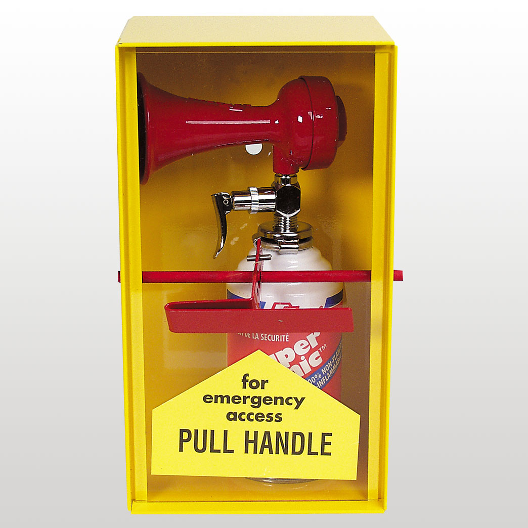
This is another design for a completely analogue alarm. In this instance the handle is pulled to release high pressure gas through a horn which creates the loud alarm noise. As interesting as this product is, I think it is far too complicated in shape to be turned into a money box of any kind.


Instead of the alarm, this time I looked into a siren light. The design of the siren light is easily recogniseable and immediately gives the sense of emergency so it would relate well to my brief. However, the design is again complex and doesn't really have any existing relationship to a money box. There is o way for the money to go it or come out, and the inside is filled with a bulb and electrical parts. Again, I would not be able to use an existing light because of the materials used to create it and I would not be able to craft it myself because of the complexity. 


Looking at a different style of the siren light, this design would have exactly the same problems as the previous one and I don't think it would work at all as a money box. 


The fire blanket seems to be a surprisingly good existing design to link with my brief. The main things that I notice are that it has a really simple shape to work with which I think could be crafted myself out of lightweight materials such as a thick card and strong glue. In terms of design, it has a large flat surface on the front which would be useful for adding instructional images and type. 
It has the tapes which create an easy way to open the box but also can be easily resealed to make sure that the money box is re-useable. Maybe the only problem is the ambiguity of the box because it could really be anything unless labelled and placed correctly. 


The fire extinguisher is undoubtedly the most recognisable symbol for an emergency that there is, though  I'm not sure if it represents a fire or an emergency more. In terms of design the extinguisher is far too complex to work with and would be quite unrealistic to use in my design. 

After looking at these I think that it is probably the fire blanket that I can work with the best so I need to develop the idea further and see if it is realistic to use as my product. 


I also found these emergency signs while I was looking for images of the equipment.
The signs are definitely immediately noticeable as being directly linked to all emergency and evacuation situations and could be really useful to use on or with my product.
The simple, bold type and illustrations are clear and leave no room for confusing the message.

Emergency Money Bank

After thinking that I came up with the idea of an emergency 'Break Glass' money bank I decided to post the existing ones here.


These are the two main ones that I could find which popped up over and over again when searching for the product. It looks at though these things are really popular as they are featured across hundreds of websites. I was genuinely surprised to know that they already existed when I searched for them on google, but I suppose it makes sense that someone could have had the same thought chain as me and come up with the same resulting idea. 

Actually the money box that I had in mind was based on the common UK fire alarm box so it would not have looked the same but I still think far too similar to take forward as the design of my final product.

Theosaurus

To start the Speaking from Experience brief I was looking at piggy banks and different innovative ways that they could be designed. I found a few different designs for the piggy banks but most of them were simple generic pigs with different patterns painted on their outside.
Until I found this variation on the piggy bank called 'Theosaurus' <- click for link


The designers simply altered the original design by making the pig stand up and using the snout nostrils as money slots.
The design itself is quite modern and has very little to suggest that it is even a pig besides the obvious snout and the ears. Other than that, we can understand that it is a pig because of its context in holding money the same way as a regular piggy bank. 


The bank comes in a few different designs but nothing drastic; the overall look and feel is kept simple. 


The whole product comes packaged in a box with an instruction booklet held in the lid. 

Although this is obviously beyond my ability to create, it definitely shows the extent of the development that could happen during the brief. The designers clearly thought outside of the normal design and what has been created before to make their design interesting and stand out from the rest.