Sunday 31 October 2010

Greenpeace - Terrified


Here is another Greenpeace campaign poster relating to the ocean. In this example the designer has taken advantage of history to communicate the message. 
The delivery is really interesting and thought provoking, especially because it makes a lot of sense and communicates the point perfectly.
The illustration design is really detailed and carefully thought out to imitate the style of old nautical legends and also looks very impressive. Illustration is definitely something that I want to try and take advantage of more in my work so this is a good example. 

Greenpeace - The Greatest Wonder

Here are some more examples of marine conservation awareness posters that Greenpeace have released in the past. These examples are a bit more like a series than the others as they all feature a similar colour palette and utilize the same kind of technique for communicating. 
These posters are photo edited designs which makes them all look quite similar and unifies them as a set. 
I think the basis for these designs is to grab attention and try to put the subject into context by creating metaphors that look just real enough to be quite clever and interesting. 
Again, each design has the Greenpeace logo.


Greenpeace

Greenpeace are well known for their positive work for the environment across the world and they also have some pretty good designers working with them.

In this example below they have shown that clever wording can be effective design and doesn't need anything particularly complex. The design is not particularly eye catching but the placement is; When someone is holding something it is generally a lot more noticeable.
The Greenpeace logo can be seen across the bottom so that everyone knows what the design is about and the poster is immediately linked to a huge context.


In this example below, Greenpeace have taken advantage of an existing design which caught a lot of attention and that most people knew about. In this way they could ensure that it would be recognised and noticed and the link to the original design applies a sense of grandeur to the new design. 
The original design was a big deal because it was the first time that anyone had tried to advertise atheism and it caused a lot of controversy across the UK. 


The Greenpeace design borrows the same idea and changes the meaning:

The End of the Line

The End of the Line is a documentary film about the state of oceans around New Zealand's commercial fisheries and the global impact of overfishing.
The film has been created by Greenpeace, WWF, Forest & Bird and ECO.
These are all leading advocates for environmental concern and each have different ways to promote their causes and different design.


This is the poster for the film. It has taken a really nice simple approach to representing the purpose of the film. It uses a clever symbol of the fish hook mixed with a fish skeleton to show how the two are literally connected.
The fact that the designers have taken advantage of the documentary being a film allows them to give it this conventional film poster look and kind of glamorise the film beyond the status of a documentary.
They are almost giving it a Hollywood-like vibe because of the connotations of the layout of the poster design which brings with it a sense of importance and status.

Tuesday 26 October 2010

Direction

I think that this might be my new direction:


The last idea was a bit far fetched because I know nothing about that audience.
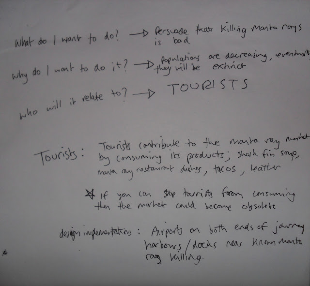
In this idea, I will be focussing on designing in mind of British tourists going on holiday to eastern Asian countries where Manta ray fishing is a problem.

One main reason for the fishing of manta rays is tourists who are interested by this foreign food which they have likely never tried before. Tourists often eat manta ray at taco stands or restaurants and may be eating it as the replica shark fin soup.

If you can stop tourists from eating manta ray abroad then I think it would prevent a lot of the killing.

I think that this is a much better direction to go in than the previous idea.

Autentika - Corporate Identity


I think this is a really nice corporate identity and relates nicely to what I want to achieve for the print brief. These designers have stuck to the 5 colour restrictions which means that each separate piece of design is immediately linked by similarity. 
Along with the bright colours, the simple shapes used connote a kind of childishness and yet the quality and detail of the range suggests professionalism.
The end result is a playful look which relates especially well to the third image down:

"To invent, you need a good imagination and a pile of junk."

Children are renowned for having brilliant and unclouded imagination so the identity of the company is really suitable to a solutions company.

Santa Monica


These posters show an impressive use of perspective to make the print design work. From up close the images just look like a pattern of different stars but as you get further away the images become more and more apparent.
This is a really clever use of print and the interaction that the audience will have with it.

Thursday 21 October 2010

Brooklyn Fare


"Brooklyn Fare is a new, full service grocery store located in Downtown Brooklyn. The identity we created is very simple: one custom proprietary typeface (Fare Serif), four colors, and lots of witty copy. The text is useful in highlighting the store's diverse range of quality products and high standard of service, while at the same time presenting the customer with a bit of humor."


Pretty nicely summed up.
I'm not really into type but I can definitely appreciate the design. What I like the most is that they gave themselves a set of restrictions to work with while designing and it clearly paid off. I think that restrictions could stop a project from becoming lost in too many ideas and keep it focussed. This is definitely something to consider in my work as I almost always get sidetracked and confuse myself. 

Manta Ray


This dish is called Kinulot na Pagi which is a dish from the Philippines. It is usually made with sting rays or shark. This particular one is from Cavite in the north of the country and according to the source is made with Manta ray.


This is a photograph taken at the Keelung Fish Market in Taiwan. According to the source these are Manta ray steaks.

Lokum - Tamer Koseli

This product has been designed as packaging for turkish delight which can also be simply made into a kind of toy. At least I think that's what is going on. 


This is quite a nice idea for a design. I like the fact that it uses such a simple net to create the toy and that it gives the packaging a secondary use instead of just holding the product. 
The character designs are quite interesting and would definitely relate to children so in all of those respects I think this is a really good product. 

It is really interesting to see the way that Koseli has kind of recycled the packaging without it ever having to be thrown away. Obviously it will eventually be thrown away because everything is but it is a nice way to look at packaging that I might try to consider in my brief. 

Print-wise I'd guess that these are just simple digital print CMYK because of the varied colours on each design although I think some of them could have been printed with 6 spot colours if mass produced. 

Alternativa 3 - Fair Trade Products

Alernativa 3 are a Spanish based fair trade company who deal with producing high quality export products and make sure that all the workers get a fair share of the profits so that everyone gets what they have worked for. They produce coffee, chocolate and a few other products for sale. 


This company deal properly with human rights which I admire in any company and I am definitely interested in pursuing ethical-based design as a future. I also really like the simple designs and use of colour. 
Each design only has about 2 or 3 different colours on it which gives it a clear and bold packaging.
This is most likely a spot colour print job because of the few colours used. 

I also really like how each different type of the same product keeps the design and just changes the colour. This gives the products a sense of branding and unifies each individual design in to a group.
In the bottom example you can see that the same kind of design has been used across a few different products which shows that they are linked together.
I will need to create some kind of product branding for my print brief.

La Perle

These label and packaging designs for beer have a similar authentic and traditional feel to them as the Bacchus Frambozenbier from the print deconstruction exercise but they have managed it solely through design and have stuck with the contemporary labels on the bottle. 

 The clever use of 40's/50's imagery gives it a really old feeling as does the wrinkled look on the labels. I can't tell if the labels are actually wrinkled or not, but it is most likely just printed that way. the colours are also quite faded looking as though the print production was done a long time ago.
Again, the use of the brown bottle makes the product seem a lot more traditional than the green or clear bottles that are used in most contemporary beers.
The designer has also cleverly linked the images with the descriptions of the beers.
It has been designed so that the type of beer relates to the women on the bottle, i.e. Blonde, Brunette etc. which are already descriptions of beers and the designer has made a clever link.
Semiotically this descriptive system is really relevant. The comparison to the women is quite sexist and a bit demeaning as are the pictures of the women smiling and effectively becoming part of the product promotion. In a way the women are being directly compared to the beer as a product.
This was relatively normal behaviour in the 40's/50's so it links in with the rest of the packaging well.

Melvin Galapon - Show Off


This is a 12" record design by Melvin Galapon. It is called Show Off and was designed for the sheffield based electro production duo Run Hide Survive. 
I really like how the design is so simple but was actually quite complex.
It is a 12 layer screen print of an edition of 100. 
I really like the use of the invisible type that can only be seen at the right angle.
Im not exactly sure how this has been produced but I think that a similar result could be created in industry using spot varnish.
The colours and the design remind me of the blocks of colour that came up when terrestrial TV would turn off really late at night before most TV became 24 hour.

Wednesday 20 October 2010

Manta Rays

I found another source that describes the manta fishing industry in a bit more detail.

http://www.iucnredlist.org/apps/redlist/details/39417/0

The information mentions several countries involved in the decline of manta ray population, specifically "Philippines, Mexico, Mozambique, Madagascar, India, Sri Lanka, Brazil, Tanzania and Indonesia."


This is definitely some information that I will need to research further.

Tuesday 19 October 2010

In Design Session - Mistakes

In this session we have been given an inDesign document with 8 mistakes and we need to try and find what they are. They are not mistakes in terms of content but more in terms of production.

1.One of the first most obvious mistakes is that there is an RGB colour in the swatches. The document is a print document so it is in CMYK format. The RGB swatch should not be there.


2. Another obvious mistake is that two of the spot colours are not used in the image but are seen in the separations preview. This means that the document will require 7 plates; C, M, Y, K and 3 other pantone spot colours. It only really needs 5 printing plates so this would create unnecessary cost.


3. There is a missing link for one of the images called "tree sillhouette.ai" which means that the original image has been moved or deleted since placing it in the document. This means that it will not be able to be printed properly.


4. the image "Bird 5.psd" is in an ok file format but the resolution of the image is set to 72PPI which is fine for screen based media but should be 300PPI for print.


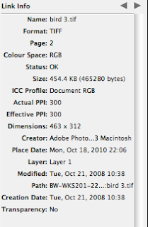
5. The image "Bird 3.tiff" is in RGB colour mode instead of CMYK.


6. The document has a bleed of 3mm which is a good standard bleed and it has been used on pages 2, 3 and 4 but not on the first page. That means that there could be mistakes in cutting the document after printing and can leave a white space around the page.


7. The image "Bird 1.tiff" has been scaled down to 15.8%. Only Adobe Illustrator files should be scaled up or down in InDesign because they are still vectorised. Other image files should be created at the size that they will be used in the document and then should not have their size changed at all.


8. The final error in the document is on the back page where it says 'Back Cover'. The type is in Registration colour which is used for registration marks and is actually printed on every plate. This can cause too much ink to be used on the paper and can cause it to tear or distort.