If starting from scratch it is always best to open a new Photoshop file in CMYK colour settings, but it is important to note that Photoshop is basically made for RGB screen work so RGB is the native setting and will have to be changed to fit print settings.
For the purposes of this exercise we were using a digital photo. As it is a digital photo, it will always be in RGB so it is a good point to work from when trying to change to CMYK.
The main problem with CMYK print is that it can not support anywhere near as many colours as RGB light can from a digital source. This means that you can have a really nice vibrant photography on screen but when it gets printed the colours become dull and it kind of ruins the photo.
Above is the original photography that we worked from. You can see that the colours are really vibrant and bright which will definitely be a problem; especially green which is a colour that CMYK struggles with quite a lot.
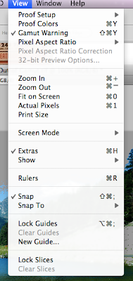
 To see exactly how much of the image can't be supported by CMYK you can select the 'Gamut Warning' option shown here in the 'View' menu.
A Gamut basically just means a range, so it is true to say that the RGB gamut is greater than the CMYK gamut.
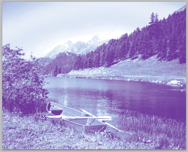
Below is the image showing the gamut warning. As you can see there is quite a lot of the sky and the grass which can't be printed in CMYK.
These bits will have to be edited to create colours which CMYK can support.
This picture shows that you can simply change the brightness and contrast or saturation to get the colours back in to the CMYK gamut.
You can also see what the image would like like if printed in CMYK by pressing this 'Proof Colours' Button in the same view toolbar.
You can see that there isn't really a great amount of difference with this image but you also have to take into account that the screen will not show exactly what prints out either as the brightness and contrast settings are varied from computer to computer.
You can also change the image directly to CMYK by pressing the 'CMYK Colour' button in Image -> Mode which will literally just pull the RGB colours back into the CMYK gamut and try to get them as close as possible to what they would be on screen.
There isn't a great deal of difference in doing it this way, but by using the Gamut Warning selection and manually changing the brightness or contrast or saturation you get to have some more control over what the image looks like which is really useful.
If you want to paint onto the workspace yourself or colour things separately then you can use the colour mixer window to make sure that you always get a CMYK colour and this is the part of the window that is important. You can see the Current colour and the new colour that you are about to select but you can also see two other symbols on the right.
The bottom symbol is for web page colours but the top symbol lets you know if the colour is outside the printing gamut.
Here you can see that the purple colour is outside the CMYK gamut because the warning symbol has come up next to the current and new colours.
You can either manually choose a new colour or just click the warning sign and Photoshop will automatically switch it to the closest possible printable colour.
As you can see the colour is quite significantly different but unfortunately CMYK isn't very good for purples.
This is the closest colour you can print to the original on a conventional printer.
Above you can see the same picture in grayscale.
You can make the image duotoned which means it uses only 2 pantone colours but can create a lot of detail and give a nice effect.
This can be found under 'Mode' as well.

A new channel can also be added and assigned a Pantone colour.
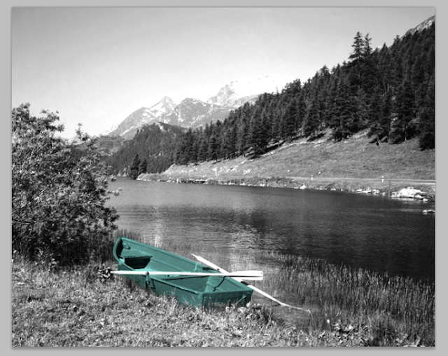
This channel can then be made whatever size or shape needed and it can colour certain portions of the image which can also give a nice effect and would only need one more spot colour plate for commercial printing.
 After a bit of tweaking and editing the channel you can end up with a quite nice looking picture.


No comments:
Post a Comment